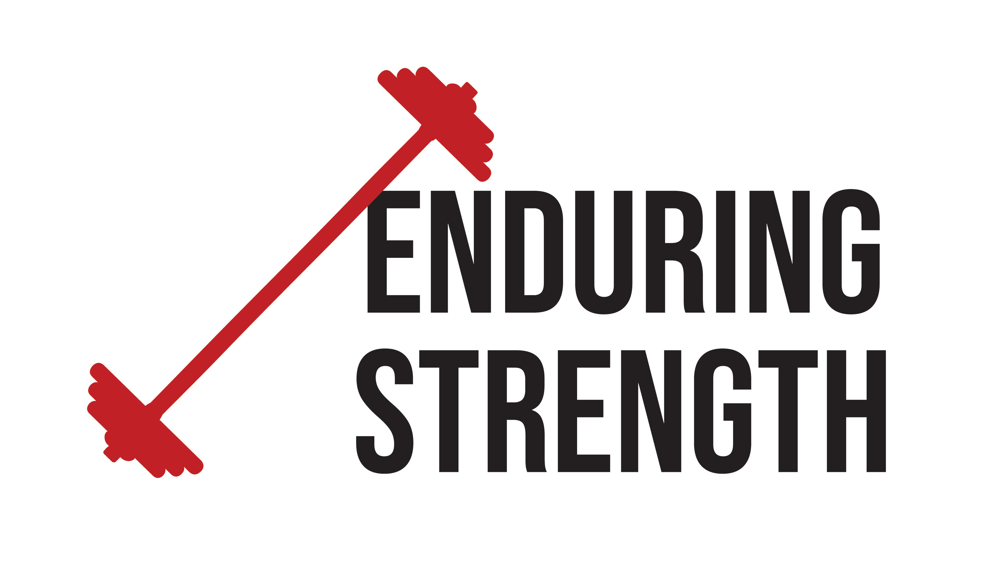
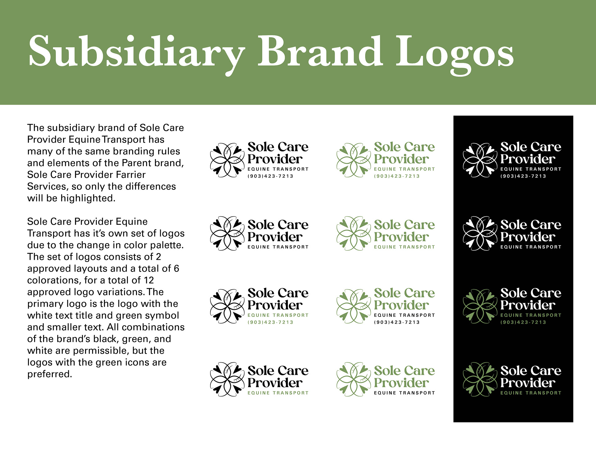
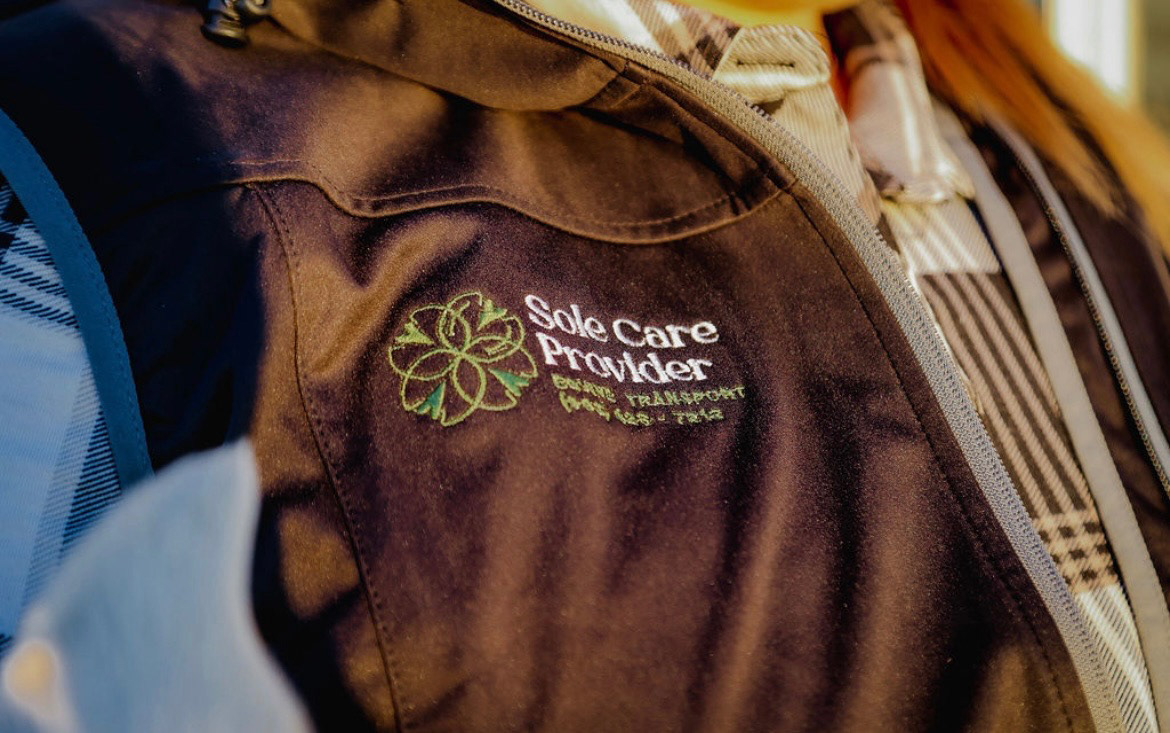
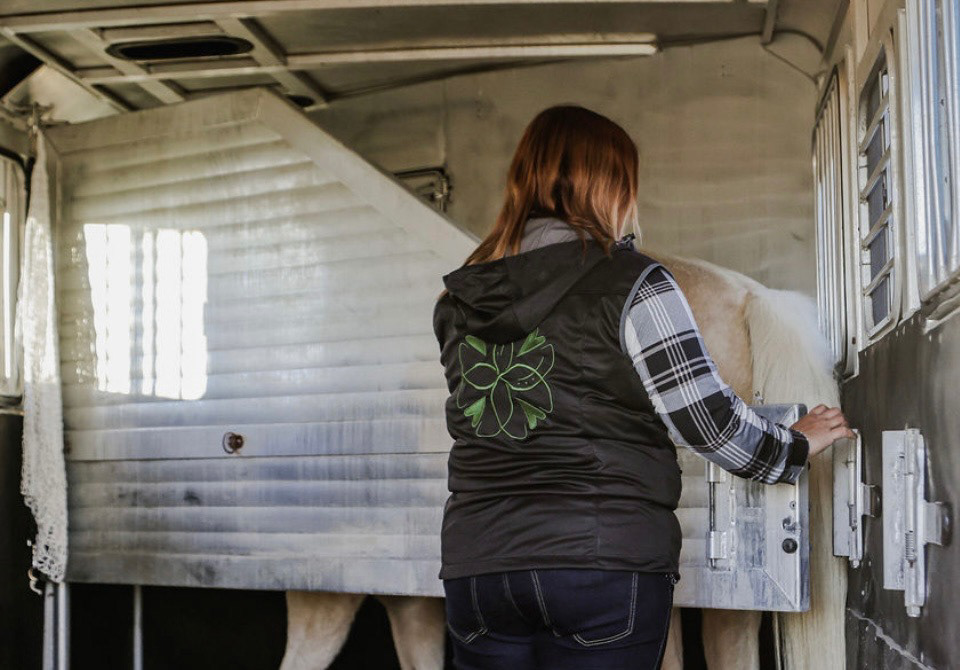
The Sole Care Provider Services brand specializes in equine services, specifically in shoeing and transporting equines. The farrier services logo was developed and launched first, so the transportation subsidiary sought to build off the established reputation of their farrier services. This branding is based on an understanding within the equine industry that the bottom of a horse's hoof is called the sole, and that the hooves are also referred to as the other four hearts of the horse because a damaged hoof is detrimental to a horse's well-being.
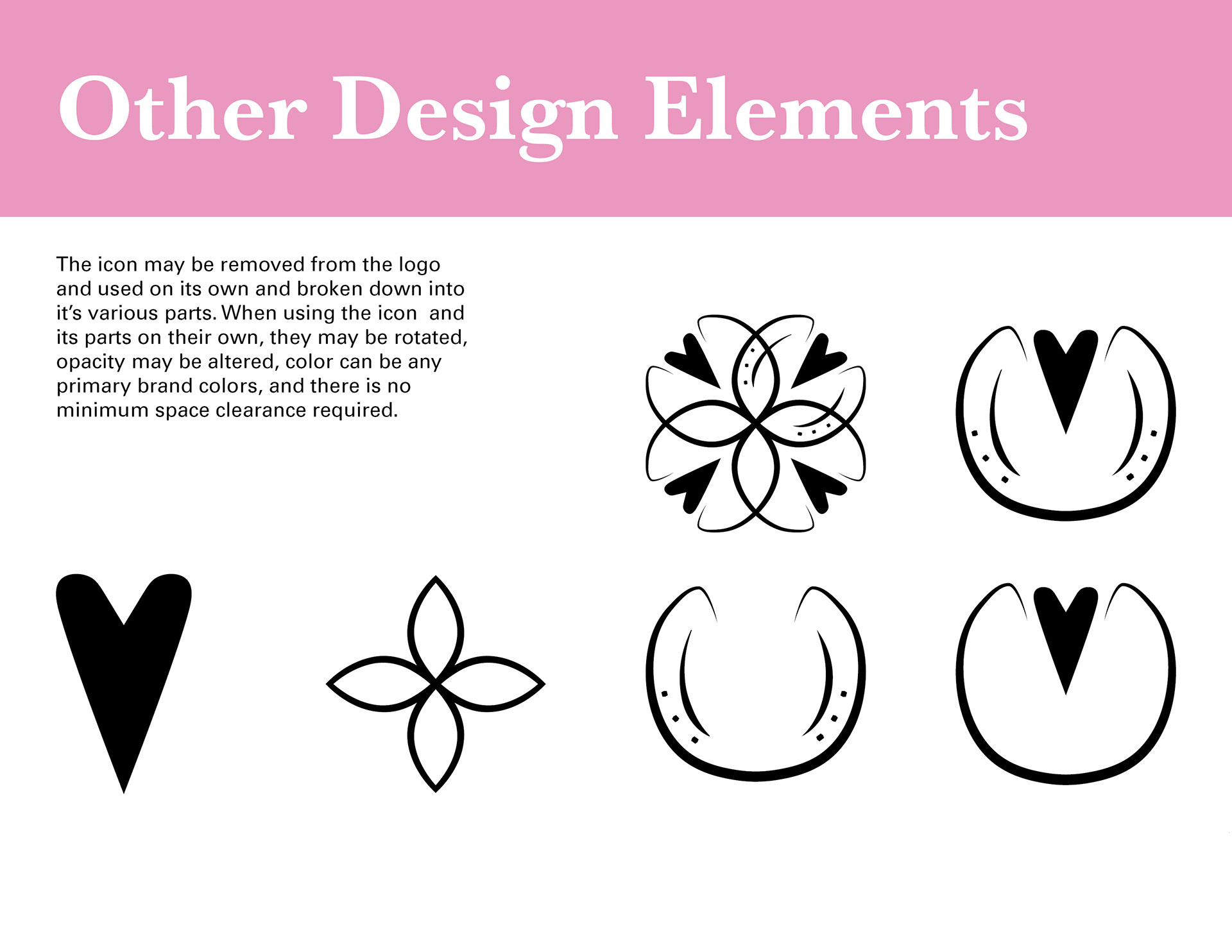
The icon was made with this understanding in mind, featuring a simplified hoof outline and the bolder shape of a heart in each hoof, resembling the shape of the heel and frog of the hoof while still displaying the double meaning of the term "sole" in the name. We also included the implication of a horseshoe in one of the hoof shapes to clearly communicate the types of services provided. This icon can be broken down into its multiple parts to create additional visual elements for the brand as it continues to mature and expand.
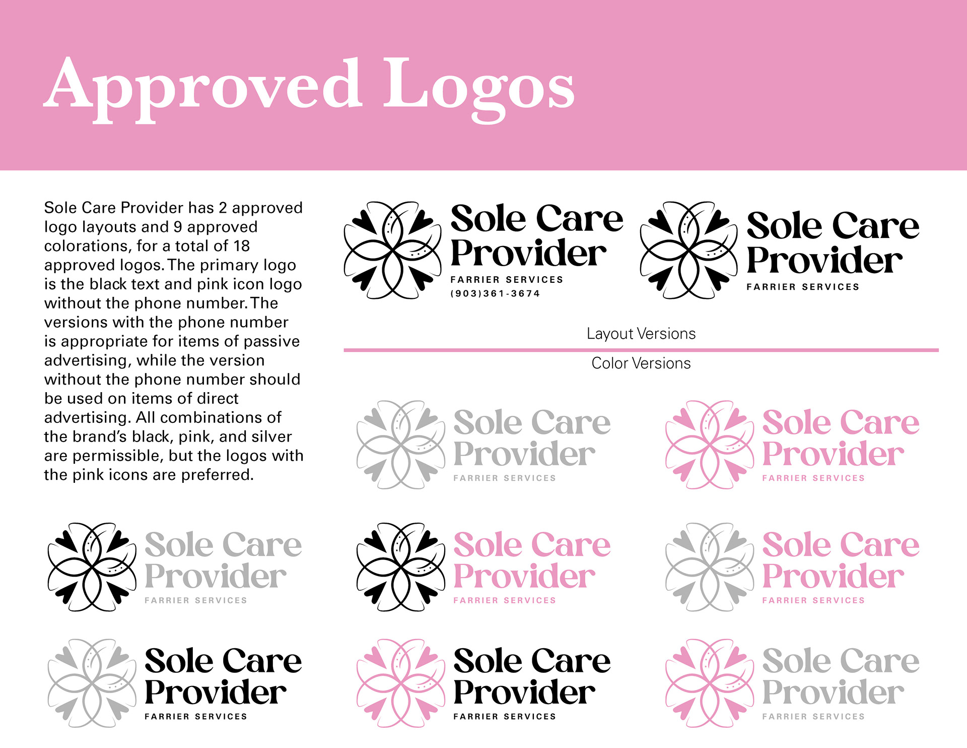
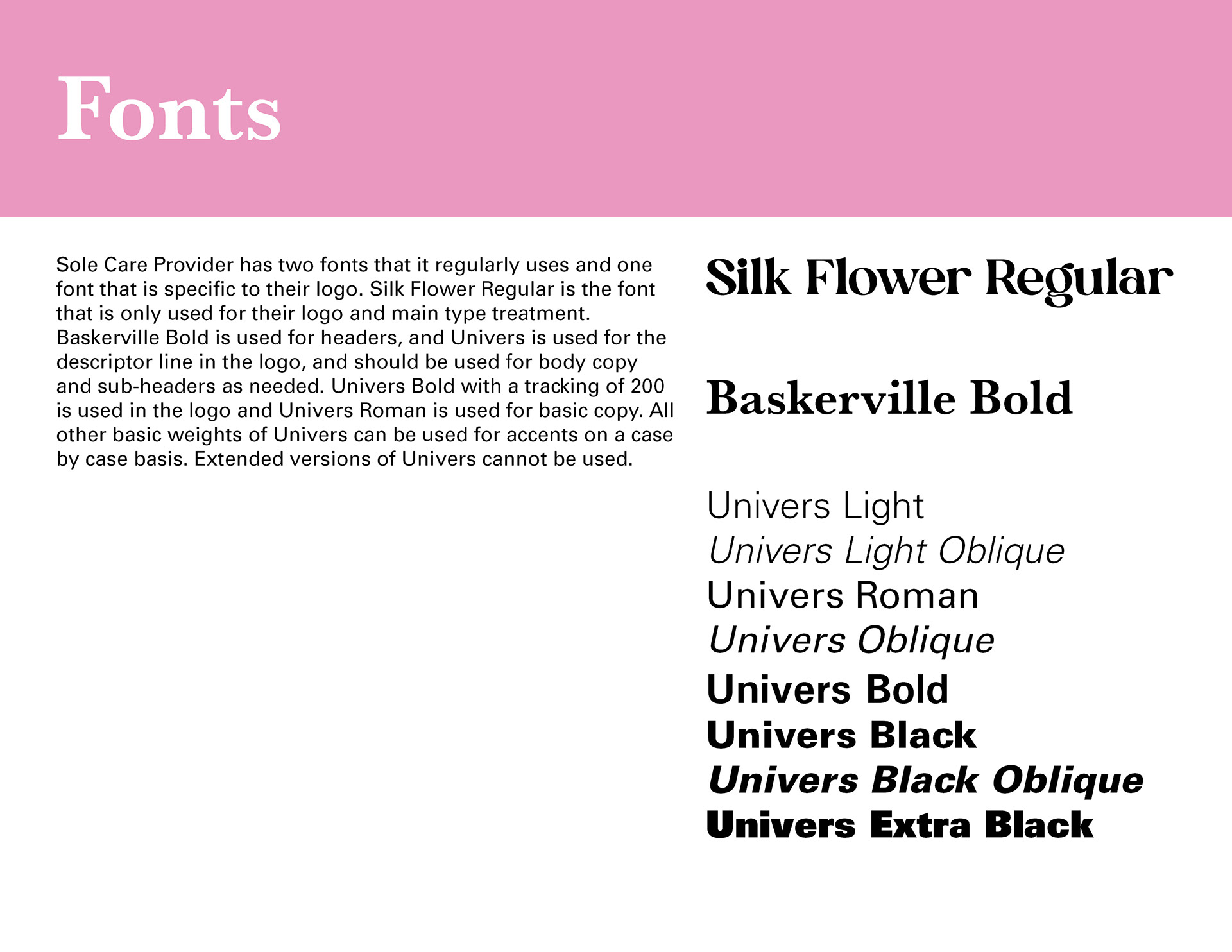
The fonts and colors chosen provide a feminine flair and sense of gentleness to the brand due to it being a woman-owned business in an industry frequently dominated by men. This feminine edge is also accompanied by a sense of strength through the bold strokes of the Silk Flower font and the more reliable structure of the Univers font. This strength was chosen to represent the bold personality of the owner and her commitment to providing superior service, as well as the hardiness required to work with equines. The decision to create two layout versions for each company was made to maintain balance within the logo while also giving the owner the ability to easily advertise her contact information whenever appropriate.


Creative Director: Kristina Edwards