Prairie Fire Pharmacy Consulting approached me asking for help designing a grief card deck. This card deck is not a standard deck of cards, but instead would have words of encouragement, affirmations, and quotes on the human experience of grief. The hope is that this deck can be given as a gift and will help navigate the struggles of grief.
The Prairie Fire owner did not want this deck to be used as an advertising mechanism; instead, it should genuinely help and encourage people. Since this was not an advertising tool, they were open to using new elements and imagery that were not closely associated with the brand, but wanted the final deck to look like it was associated with the larger brand for future use.
They provided a few inspiration images, the content for the front of the cards, their brand guidelines, and initially stated that they wanted to use the image of a compass and to use minimal color.
Sketches
In these first sketches I provided to Prairie Fire, I presented four possible layouts and styles for the back of the card based on their initial direction. Since the back of the card is the most visually prominent part of a deck, we decided this design should be used to add additional elements to the front of the cards.
When I showed these sketches to the client, they were drawn to the top two designs and requested to see those expanded into digital form. They appreciated the symmetry within the four quadrants and liked the high visibility of the compass in those designs.
First Digital Designs
In these first digital designs, I took the two sketches that the client most liked and digitally rendered them. I stayed as close to the original sketches as possible while maintaining mathematical symmetry. I then added colors and made minor alterations to the designs to provide options to the client of various combinations that are visually appealing. While the client only noted that they wanted to use black, white and gold, I found the purple in their branding to be a lovely color that paired beautifully with the designs.
At this point, the client most liked options E and F, and wanted to see some options with the inside of the compass filled in white. They also noted that the black was a little harsh for the visuals they wanted, and liked the color scheme of option F.
Second Digital Designs
In this second round, I showed the client the options of making the inside of the compass white. I also started experimenting with how we could bring the design and colors of the back illustration to the front of the cards.
The client decided the white in the compass did not look how they had hoped, and they wanted to move forward to the final stages with Design F from the first digital designs. On the front of the cards, the client decided to use the style of Option 3, with the colored border and golden filter applied to the background.
Final Product
To make this project a reality, I helped the client research vendors that print fully custom card decks. We found a vendor that produced high-quality cards at a price point within the client's budget. I made these designs usable for the client by utilizing the Canva document they had originally created. I customized each page for layout and style consistency and ensured that the Canva document would be compatible with the print vendor's needs to produce high-quality cards.
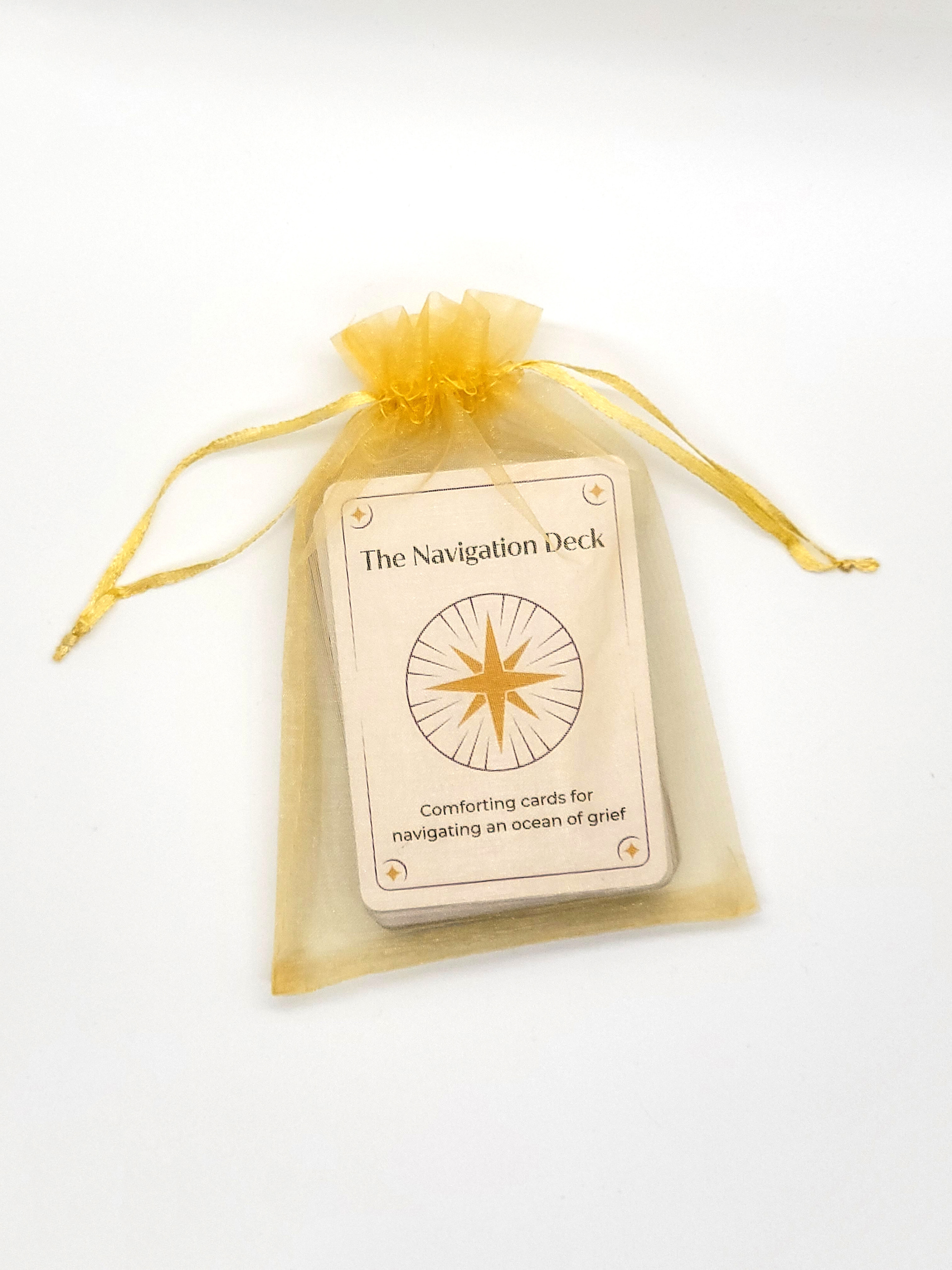
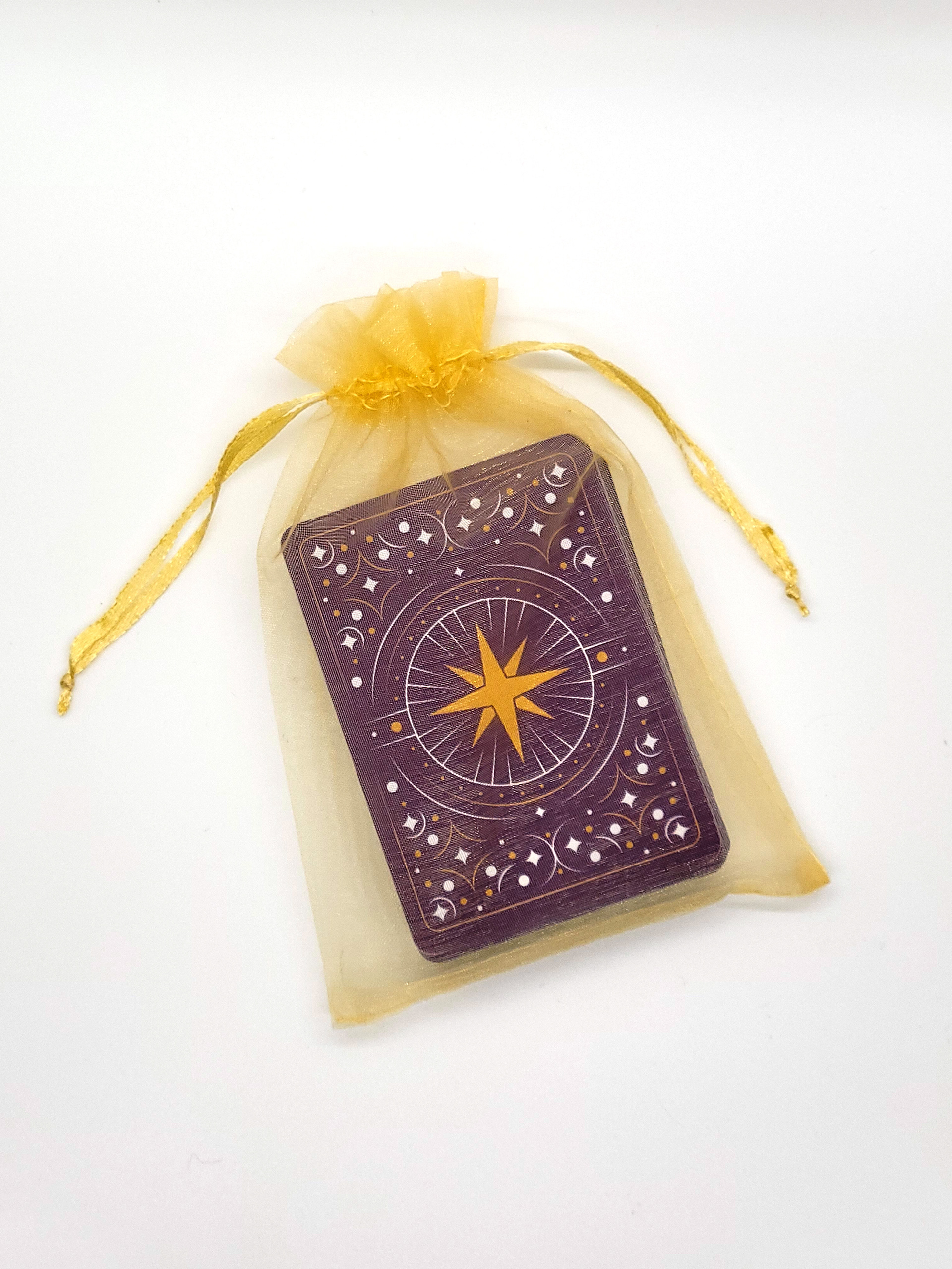
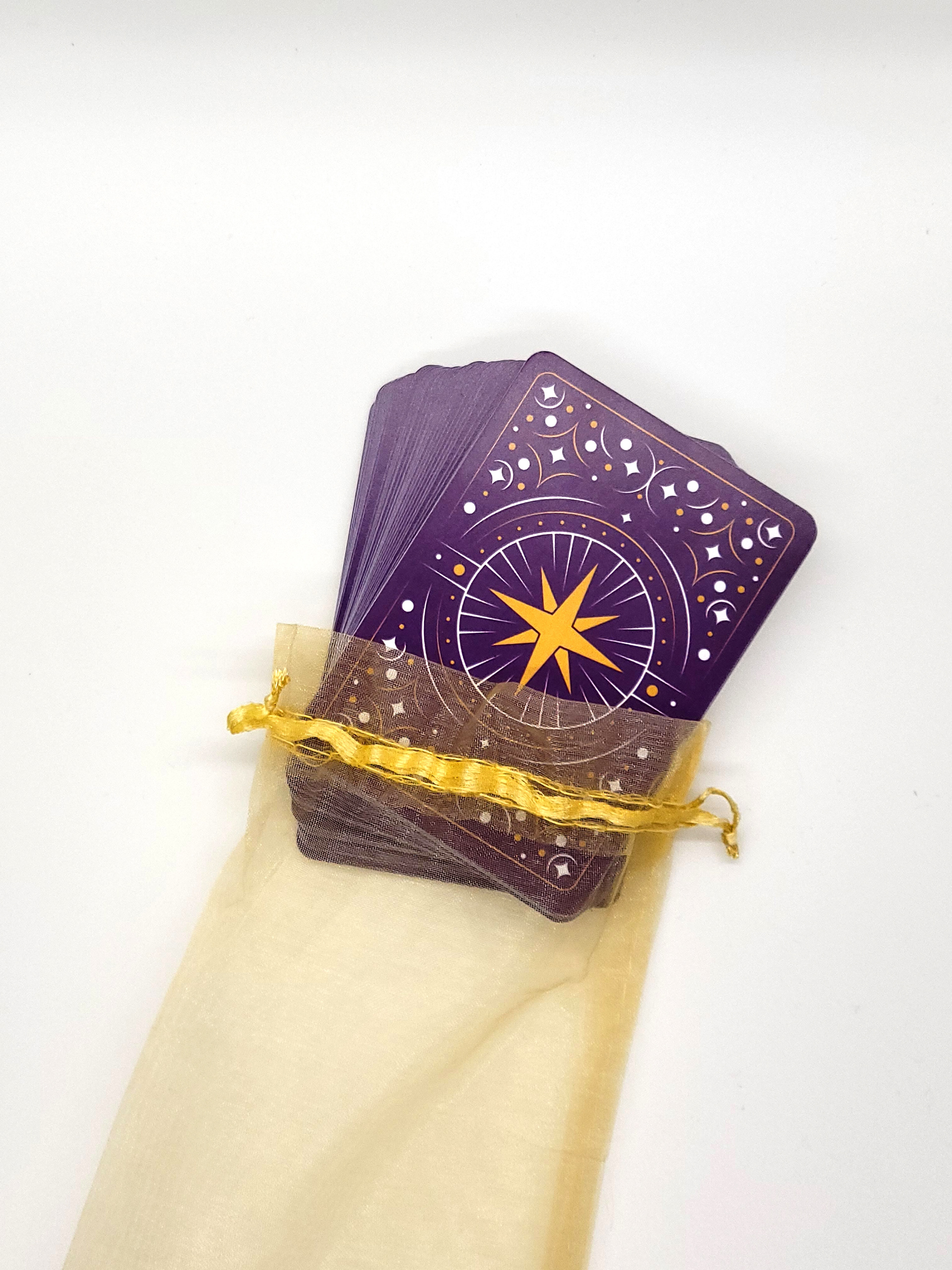
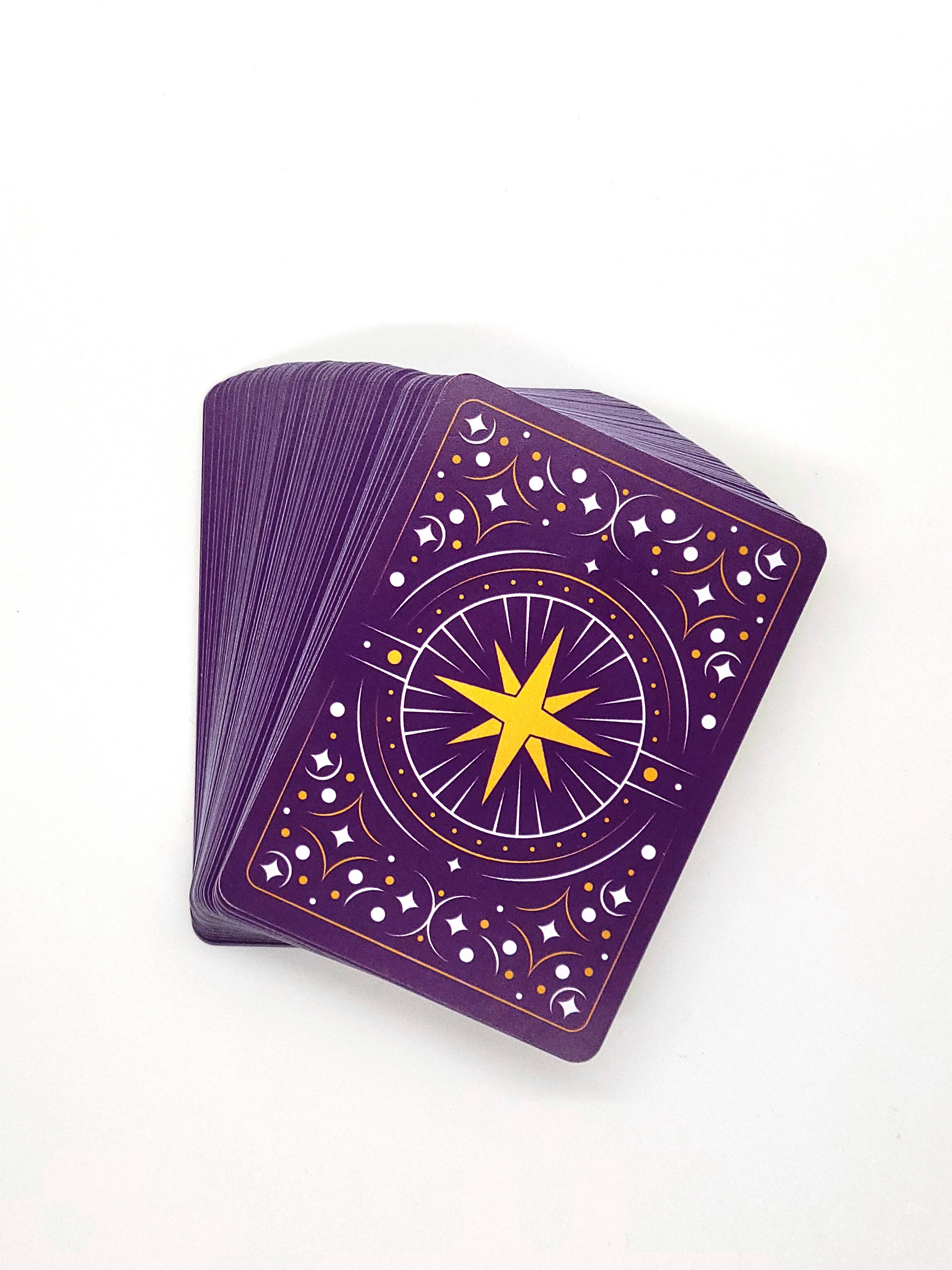
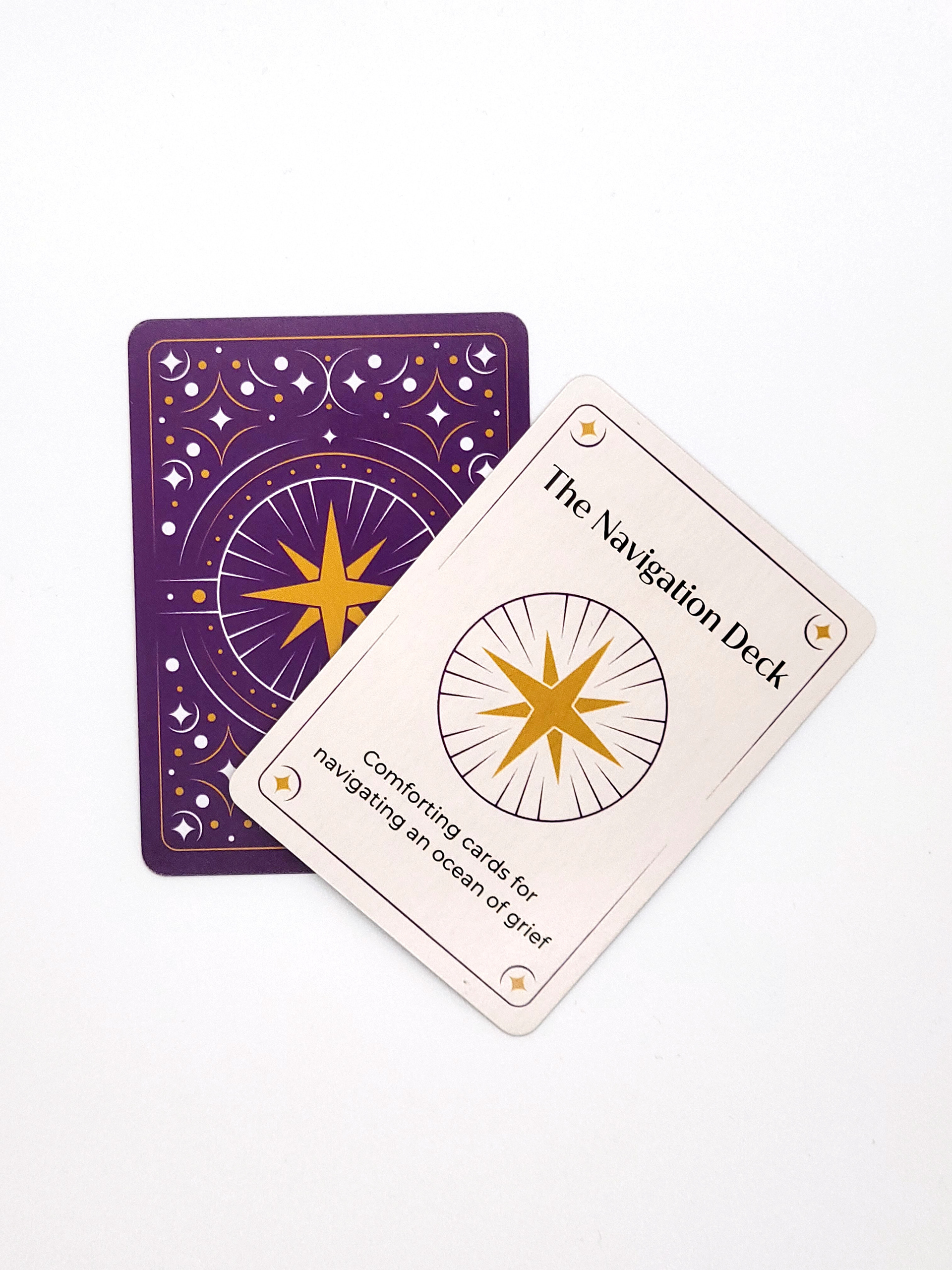
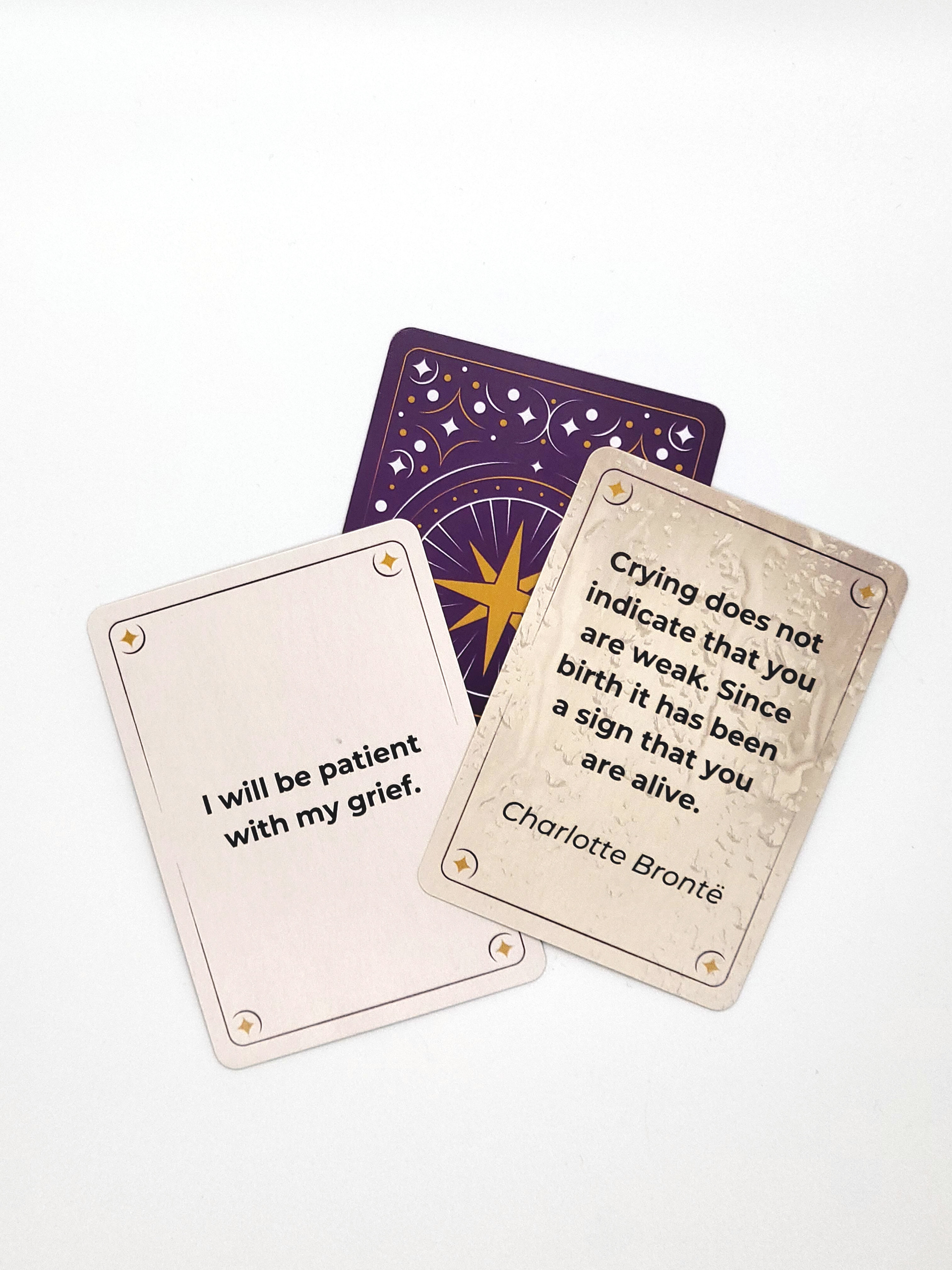
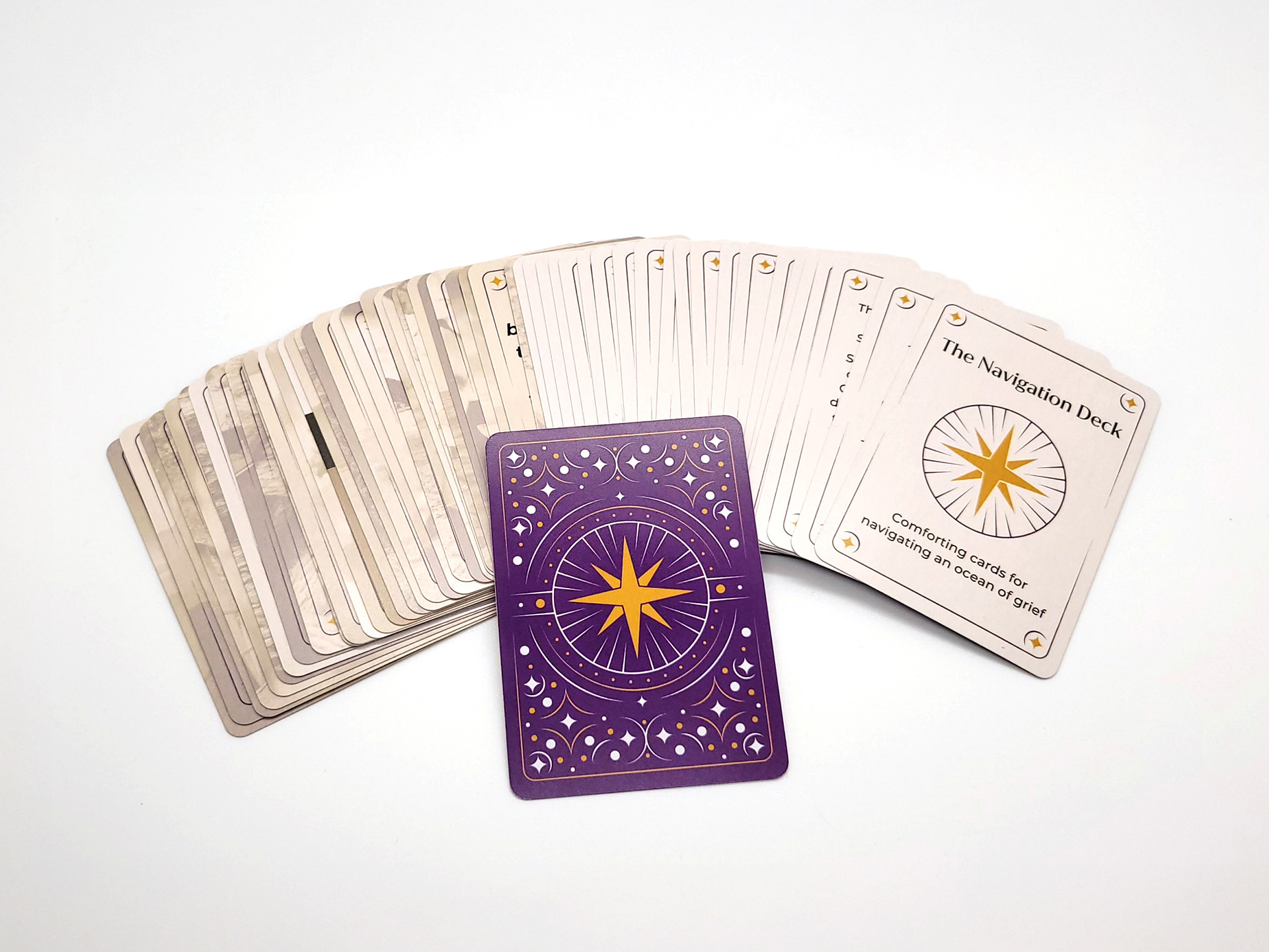
In the end, we were able to produce a beautiful deck of cards to help people navigate grief. The colors and illustrations are elegant and may be associated with twilight, the ending of a day, which pairs beautifully with the ending of a life. Each card is unique, yet the border and toned imagery create consistency within the deck and a soft and comforting experience for the user.
Sales Collateral
Shortly after the card decks were printed and delivered, the client requested some flyers to assist with sales of the deck at an upcoming event. They requested both a single page and a double page design to provide flexibility of use. They also did not have the QR code or website quite up and operational, and asked me to provide designs that allowed them to add these details at a later date.
Using the above custom photography, and content provided by the client, I provided them with 2 flyers that highlight the aesthetic nature and functionality of the deck and the user experience, while ensuring the design was fully prepared to be completed with the QR code and link, and then printed by the client.
Using the above custom photography, and content provided by the client, I provided them with 2 flyers that highlight the aesthetic nature and functionality of the deck and the user experience, while ensuring the design was fully prepared to be completed with the QR code and link, and then printed by the client.
Single Page Flyer
Two Page Flyer Front
Two Page Flyer Back


